Design and Branding Journal for Brighton Estate Agents Phillips & Still
Author:
Adam Prew
Published: 24/03/2014
A new estate agent came to us needing a whole new brand design
I didn’t know much about them or their new company so an initial meeting was set up for me to meet the guys and discuss their thoughts and ideas for the brand.
Branding a local estate agent - The initial meeting
For the first meeting there are a set of questions that I ask the client about themselves and their company in order to then go away and write up a spec and brief for their job. The list of questions starts from simple questions such as, what is your business, to more in-depth questions about the design. A strong point which I picked up was their unique selling point; due to the small size of the business customers will be dealing with them directly – a close relationship with clients that is hard to come by, particularly with some of the larger estate agents in the surrounding area. It is important for me to identify these aspects in the business to illustrate them in their brand to advertise and really sell their best aspects.
Creating the initial brand concept
As of this I began my first proof by looking at this concept – I wanted to portray both of their personalities and identities to reflect their unique selling point. I knew that I had to do this typographically due to the feedback from them in the meeting, the examples and research that they showed me all resembled strong, typographic routes which was something they liked. I began by sketching out initial thoughts and combined this with research into existing brands and identities; I always find it helps to have something visual to back up my sketches. One of my first thoughts was to show their personalities by having different weights in the name (an idea which lead to the final design) by making the two words Phillips & Still visually different it showed how they have variations but belong under the same umbrella.
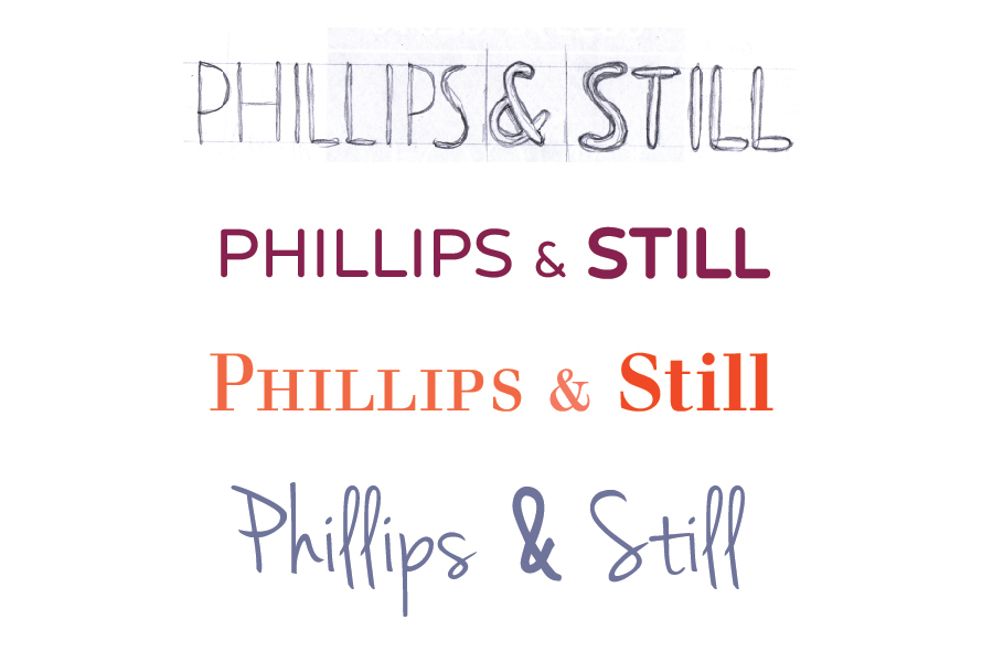
This concept was sent in the first proof with two other variations in colour and typeface. I always seem to feel slightly nervous after sending a first proof, it’s the client’s first insight into your thoughts and how you portray their brand. At this stage the design is rough, a concept which if liked will be polished and finalised in the coming proofs. I received feedback from the clients which is usual after the first proof, we like it, but there are some tweaks. I was happy enough to take this as a good sign and sat down with them again to talk through the changes.
Progressing from the original three design concepts
One design stood out for them, the first design that I created (which for some reason always seems to be the way!) but the layout and colour needed changing. They were also keen to see this same concept but executed in different styles of typefaces. Feedback like this is good, certain direction can help me understand what it is they like in the designs.
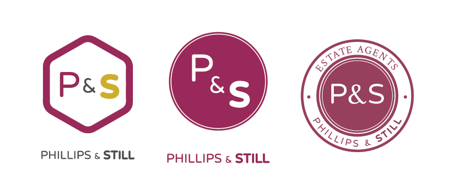
Creating a secondary logo design
After refining the idea we began to think about the secondary logo. A secondary version is typically created for use where space is limited. As the primary design is long in length, a circular version was created to use on items such as their for sale boards. I began to play around with using just the P & S, in shapes such as circles and rectangles. After a couple more proofs, the clients were happy with both the primary and secondary versions of the logo.
Choosing the correct colour
The final amendments came with the colour. Colour always comes down to personal preference, there is never a right or wrong, some colours can clash and others work well together, but there is no written rule to say what is correct. I had begun proofing the clients with a burgundy and yellow to reflect luxury. It soon became apparent that there was some confusion with the colours, I would refer to it as burgundy, and the clients as purple.
The appearance of colour of different devices
It soon came to realisation that the clients were viewing the proofs on devices that had different colour resolutions, such as phones and tablets. This can drastically change the way colours appear and I always try to encourage proofs to be viewed on desktops where resolution is set correctly. As of this we had to revise the proofs to make sure the colours were correct and would come out as expected.

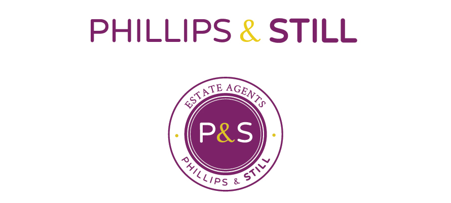
The finished brand design
Once the colours had been finalised we were pleased to sign off both the primary and secondary versions of the logo. We always send both print and web files ready for the client to start using!
From branding to business stationery
With the branding signed off we were able to produce their stationery and literature designs ready for their grand opening. With the colour problems we had previously it became apparent that the problems would not stop there! The items that were printed on uncoated stock came out too dark, we had to revise the colours again which resulted in two different sets of colour values for the brand, one for coated stock, one for uncoated. These kinds of problems can pop up now and again, and its our job to eliminate them early on – they now have their values set up for future use which should cause them no problems.
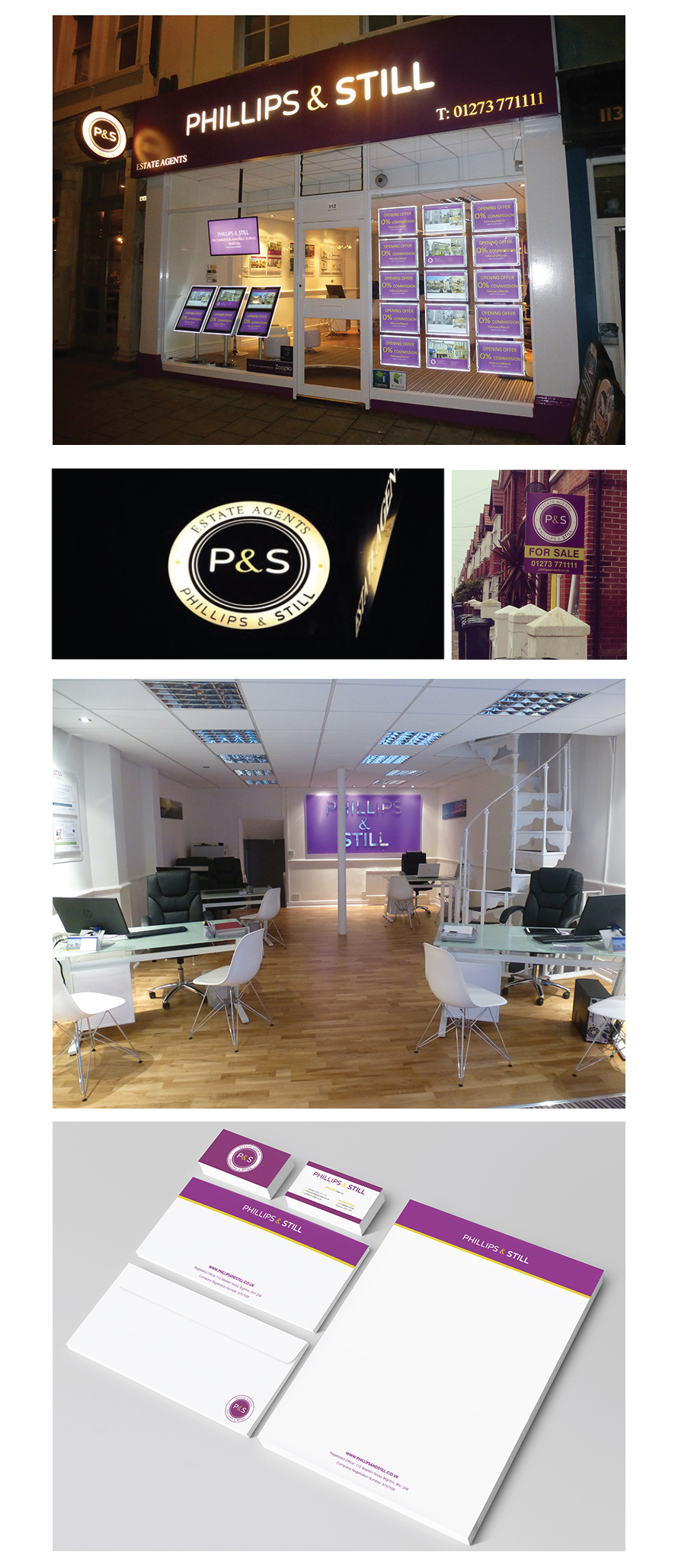
With the whole brand signed off and ready to go it was great to see the office up and running with the logo designs featured on the external front and inside too. It was great for me to see the logo design applied to so many different printing techniques, from the Perspex light fittings to the inside signage interiors and its always great to hear good feedback from the clients themselves.
Testimonial
“I would like to say thank you for all you work and ideas regarding the design and Logo for our Estate Agency “Phillips and Still”. We were very happy with the final product and have had many compliments from the public to how good the office looks and how eye-catching the logo is. We were impressed by how not only did you come up with your own ideas but also how you were willing to try any changes we wanted, and I feel by working together we got the results that we wanted. I would definitely recommend using Vicky and face media in the future.”
- Richard Phillips, Phillips & Still.